Gr33nWh33lz
Visual Identity Design, Brand Management, Illustration, Brand Dtrategy.
Project Type
Brand Identity and Strategy
Year
2024
Role
Brand Manager
Project Team
Alex Tudun
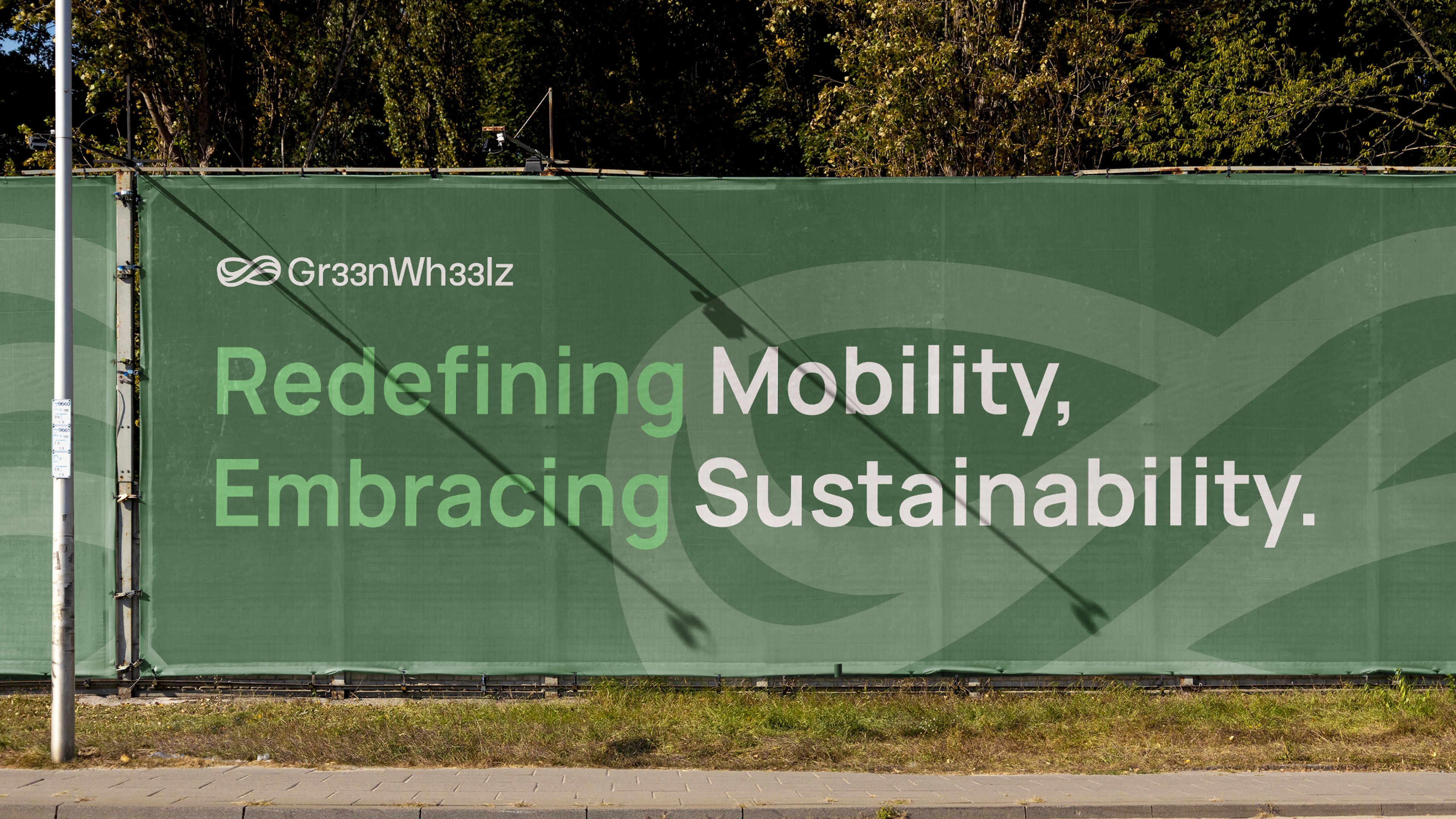
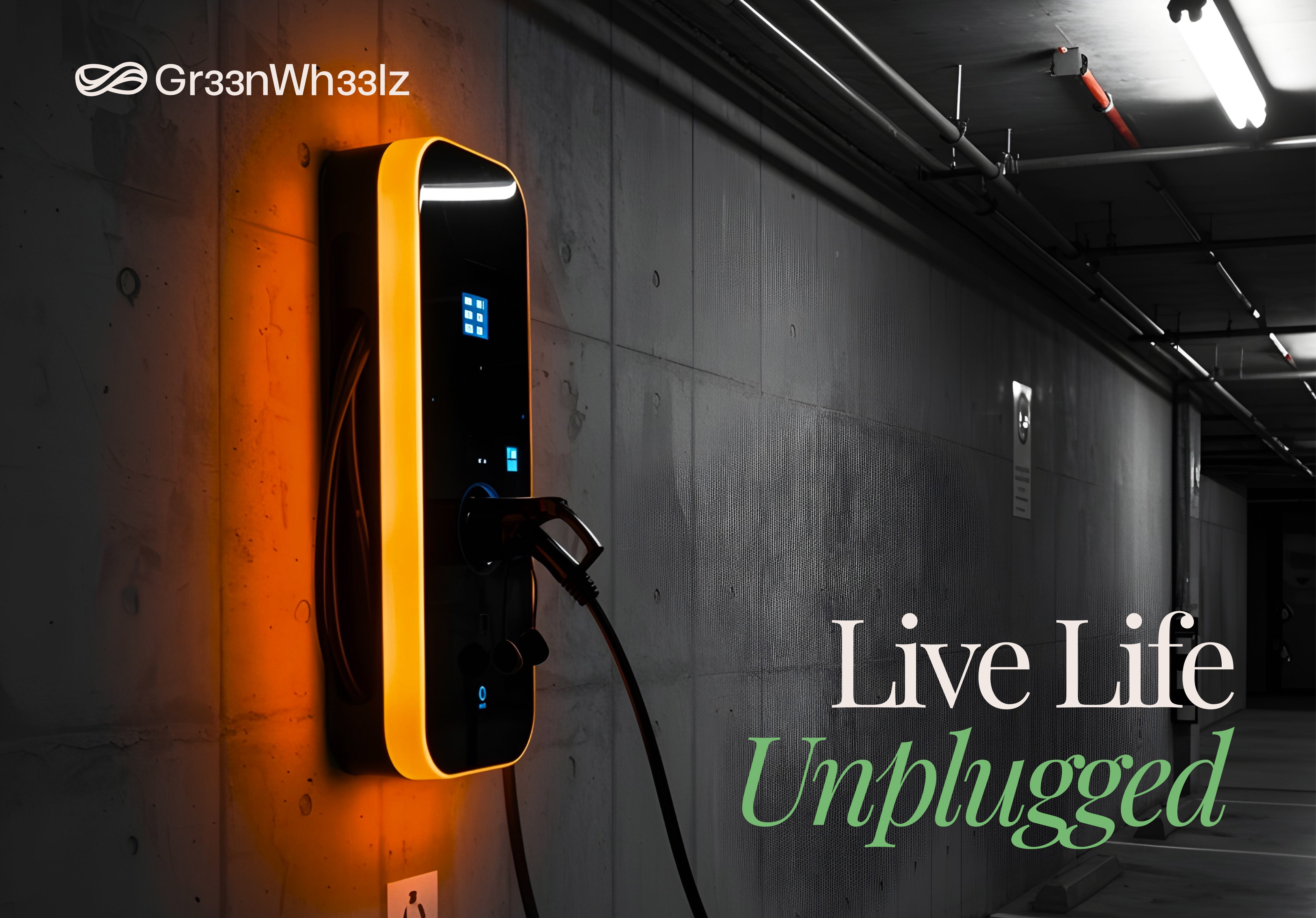
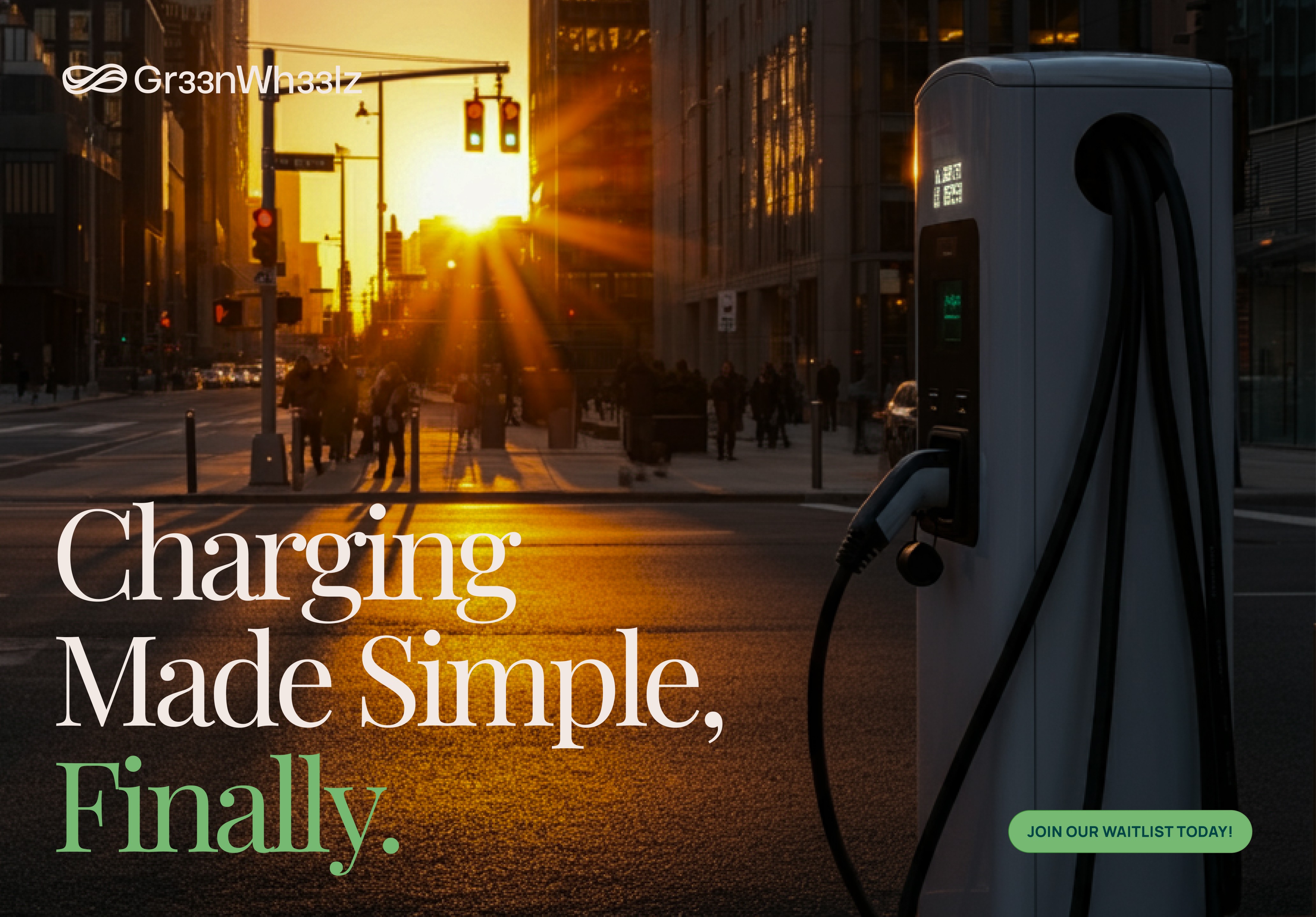
Electric car charging feels complicated because most platforms make it complicated. Gr33nwh33lz simplifies the experience; making charging accessible and seamless. The platform exists digitally and physically, so the identity needed to adapt across surfaces without losing clarity. Beyond the logo, the brand required illustrations that explain complex charging scenarios immediately and icons that work at any scale. The challenge was creating a system that says "future-focused" and "easy to use" at the same time, without the tech-forward aesthetic overwhelming people who just want to charge their car and go.
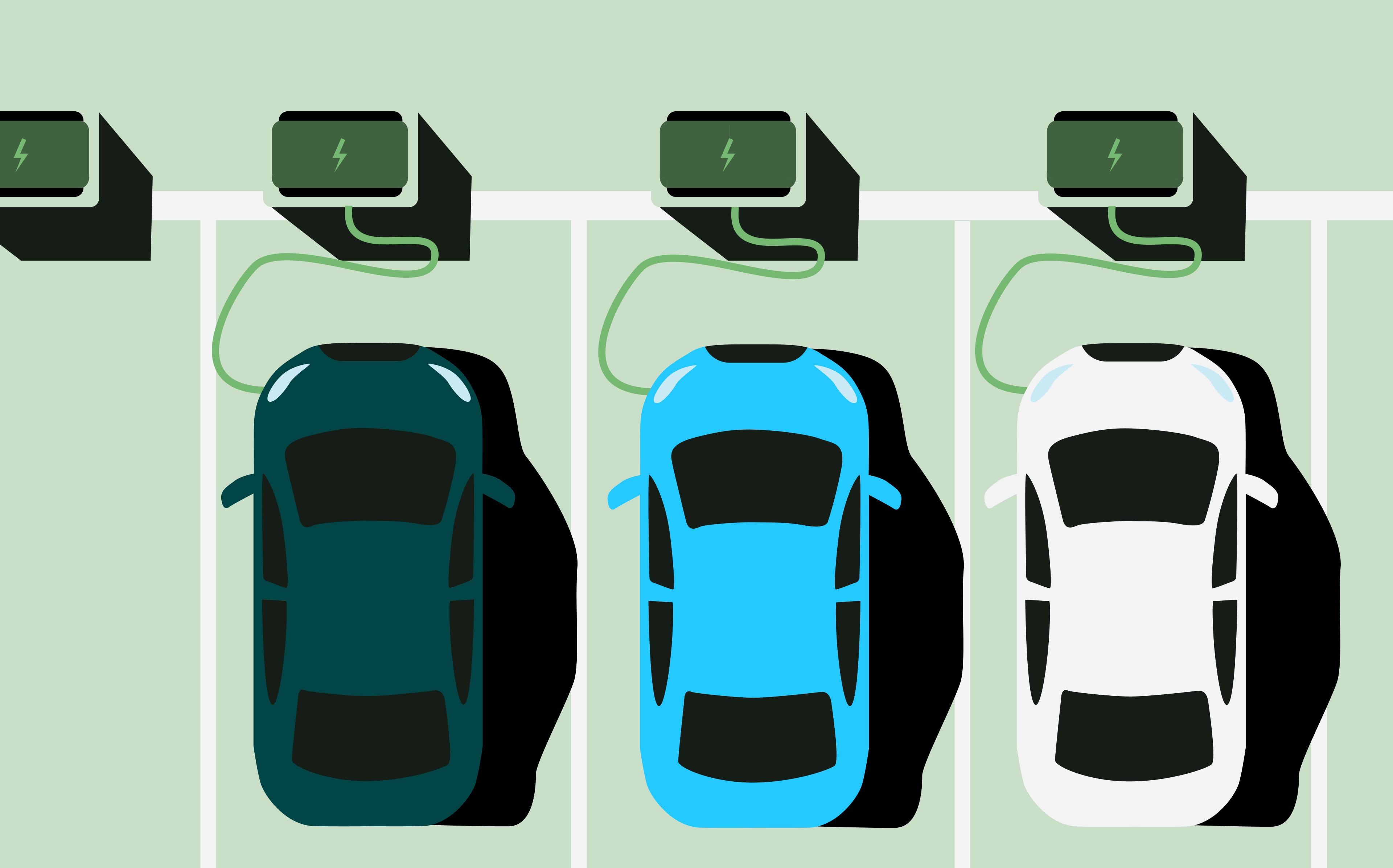
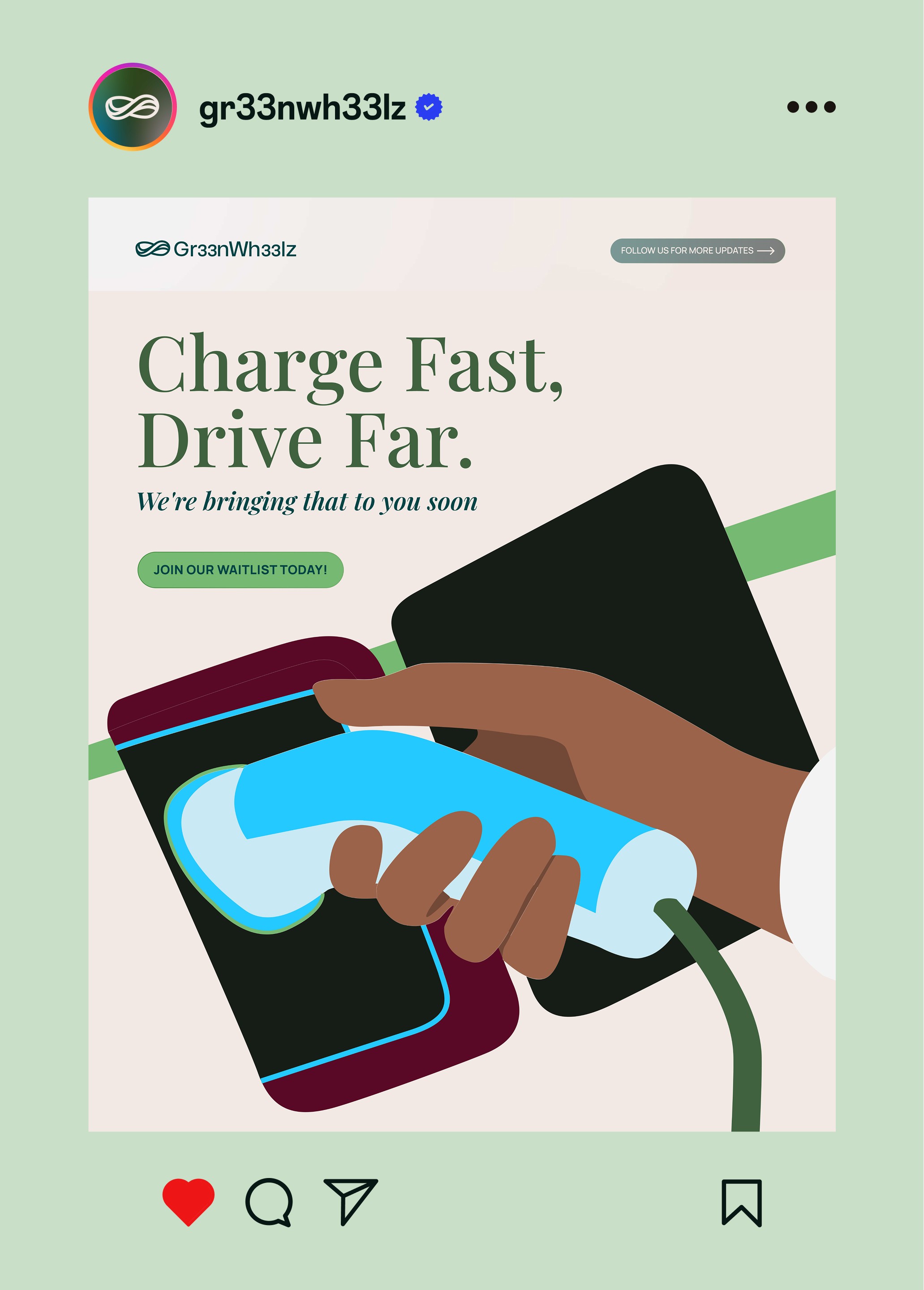
The logo fuses three ideas into one mark: a futuristic EV shape (innovation), the infinity symbol (sustainability), and a winding road path (connectivity). Everything in the system traces back to sustainability as the organizing principle. The illustration system uses flat shapes with bold shadows and a limited palette—greens, blues, neutrals—to explain charging scenarios without words. Empty state illustrations handle the complex moments: what happens when no charger is available, how payment works, where to find stations. Icons scale from app to signage. The system maintain consistency across platforms. The visual language stays simple because the technology shouldn't require explanation. People want to charge fast and leave. The identity gets out of their way while building trust that the infrastructure works.


Previous Project
Next Project