
Crayvns
Visual Identity Design, Brand Strategy
Project Type
Brand Identity
Year
2025
Role
Lead Brand Designer
Project Team
Alex Tudun
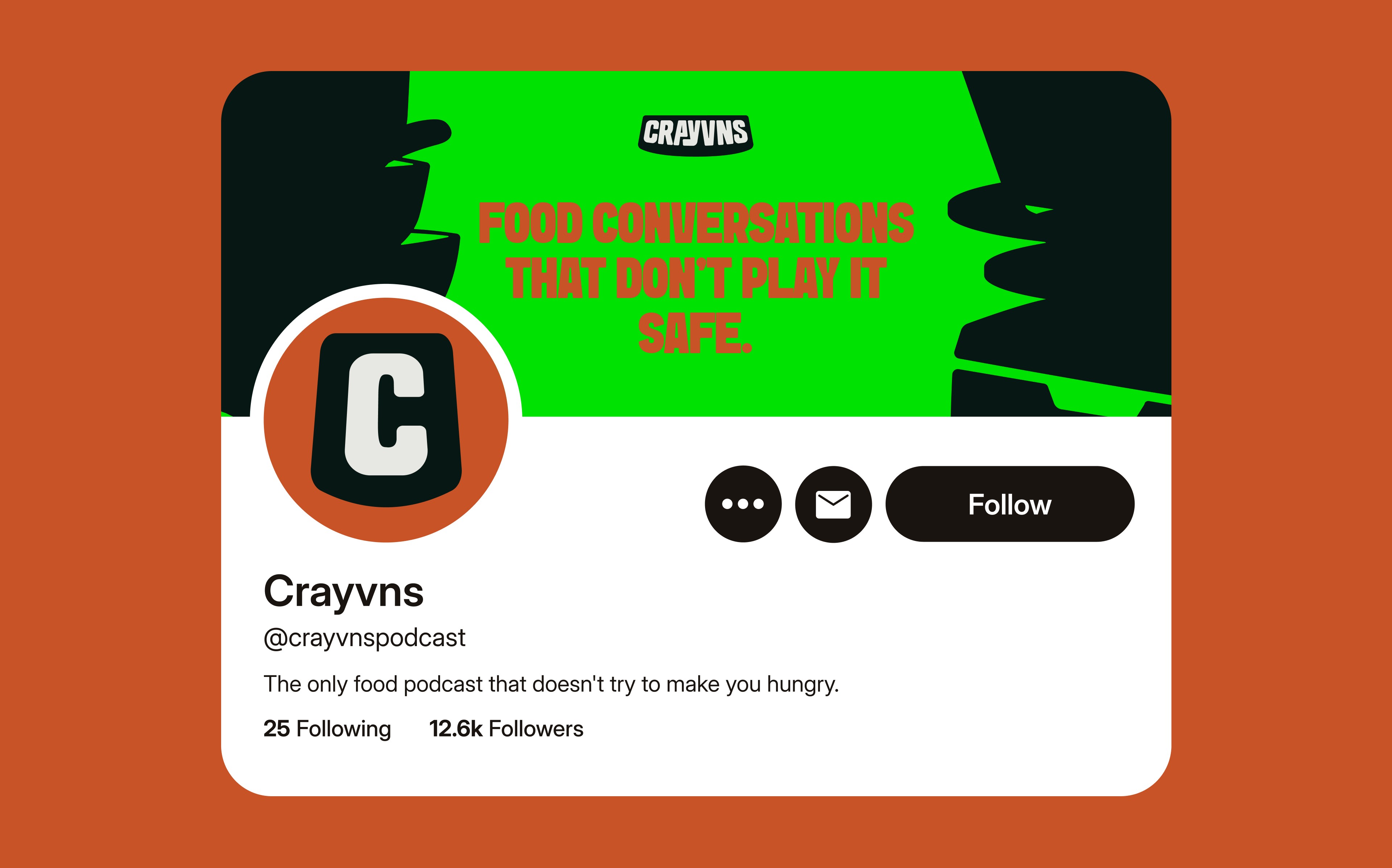
Food podcasts normally default to coddling. They convince, they educate, they romanticize. Cravyns does none of that. It's a food podcast built on hot takes, judgment, and making people think rather than just eat. The brand needed to challenge conventional food conversations; not through what they say, but through how they look before anyone hits play. The challenge was making sure the visual system had the same confrontational energy as the content: bold, opinionated, impossible to ignore.
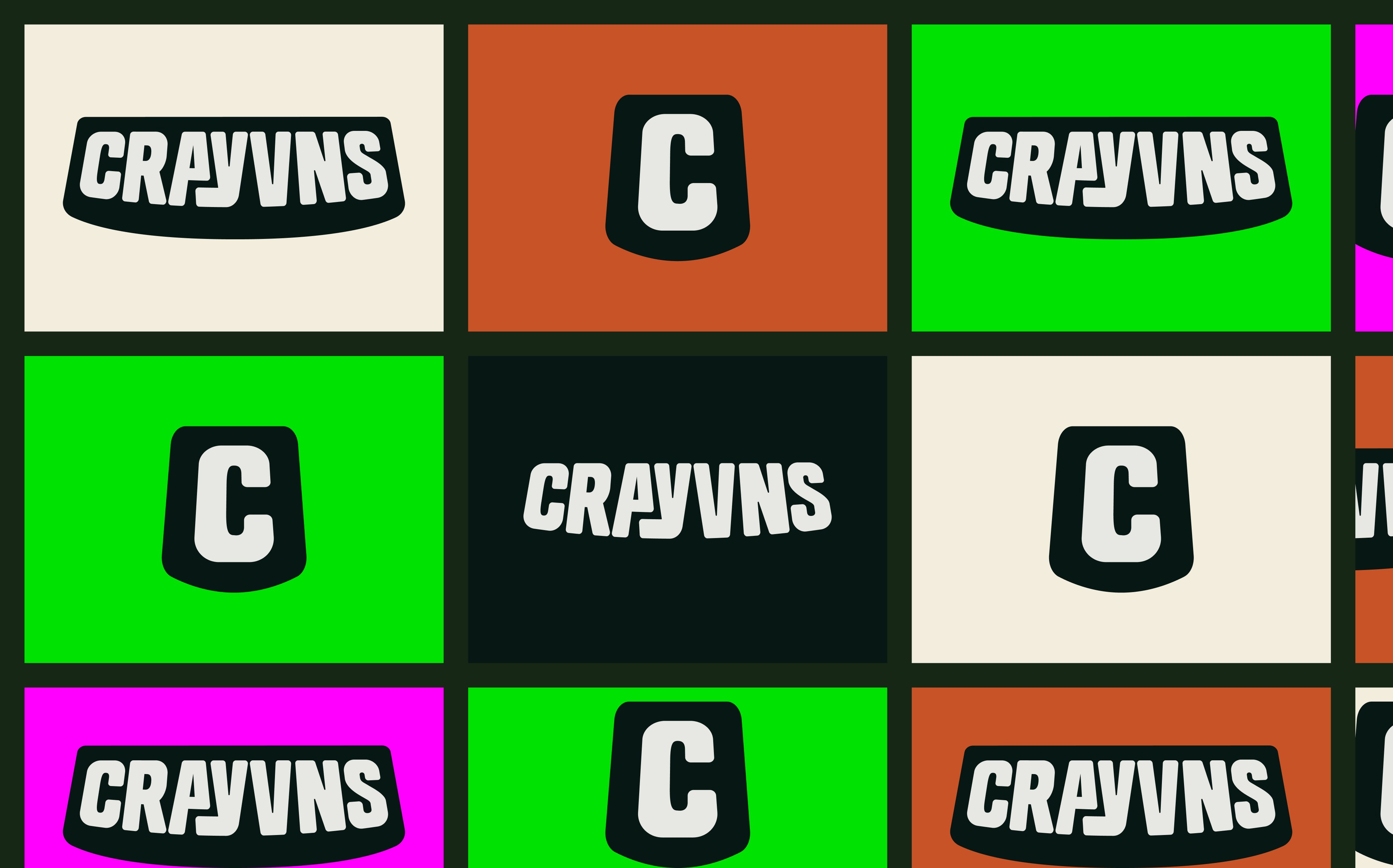
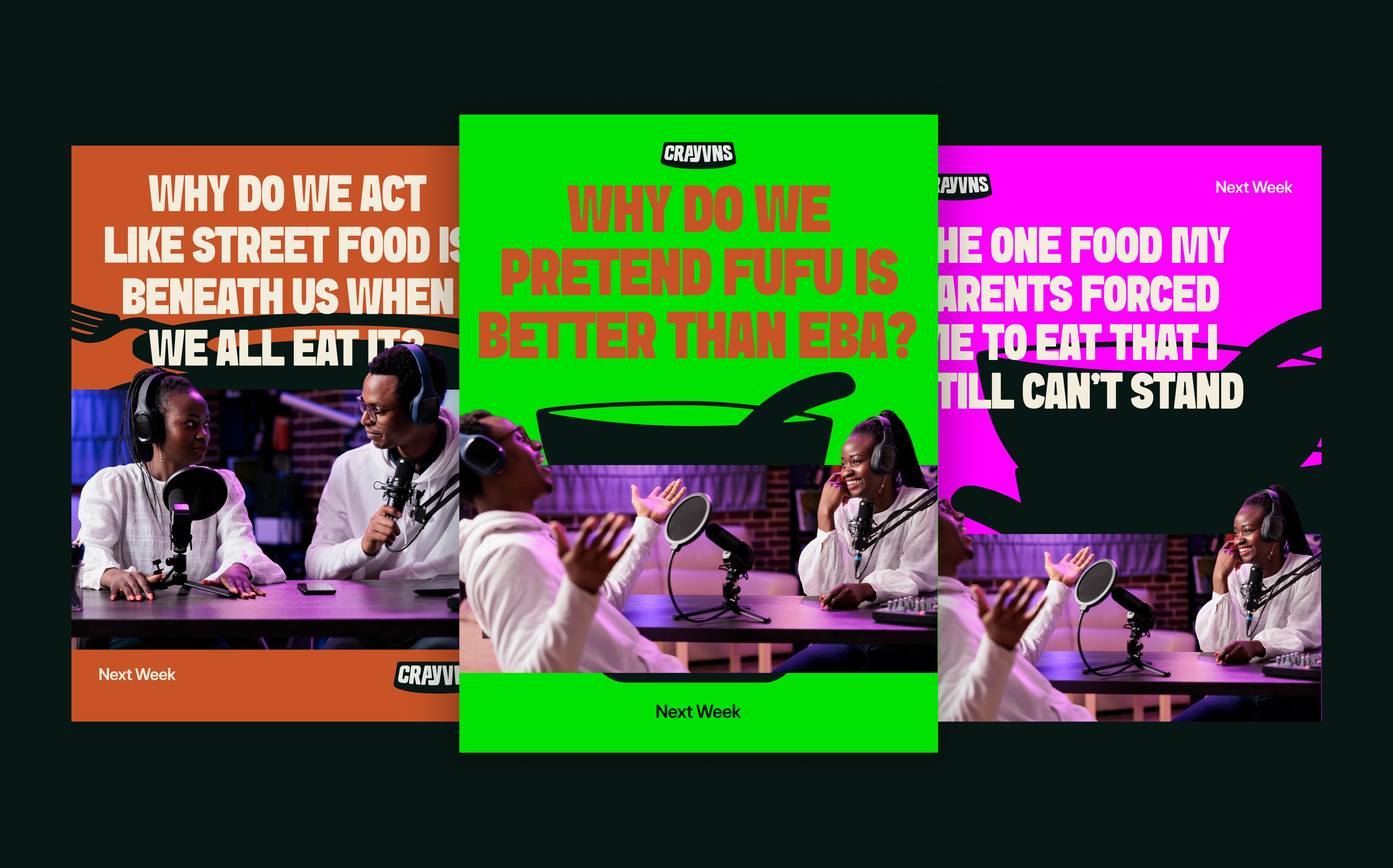
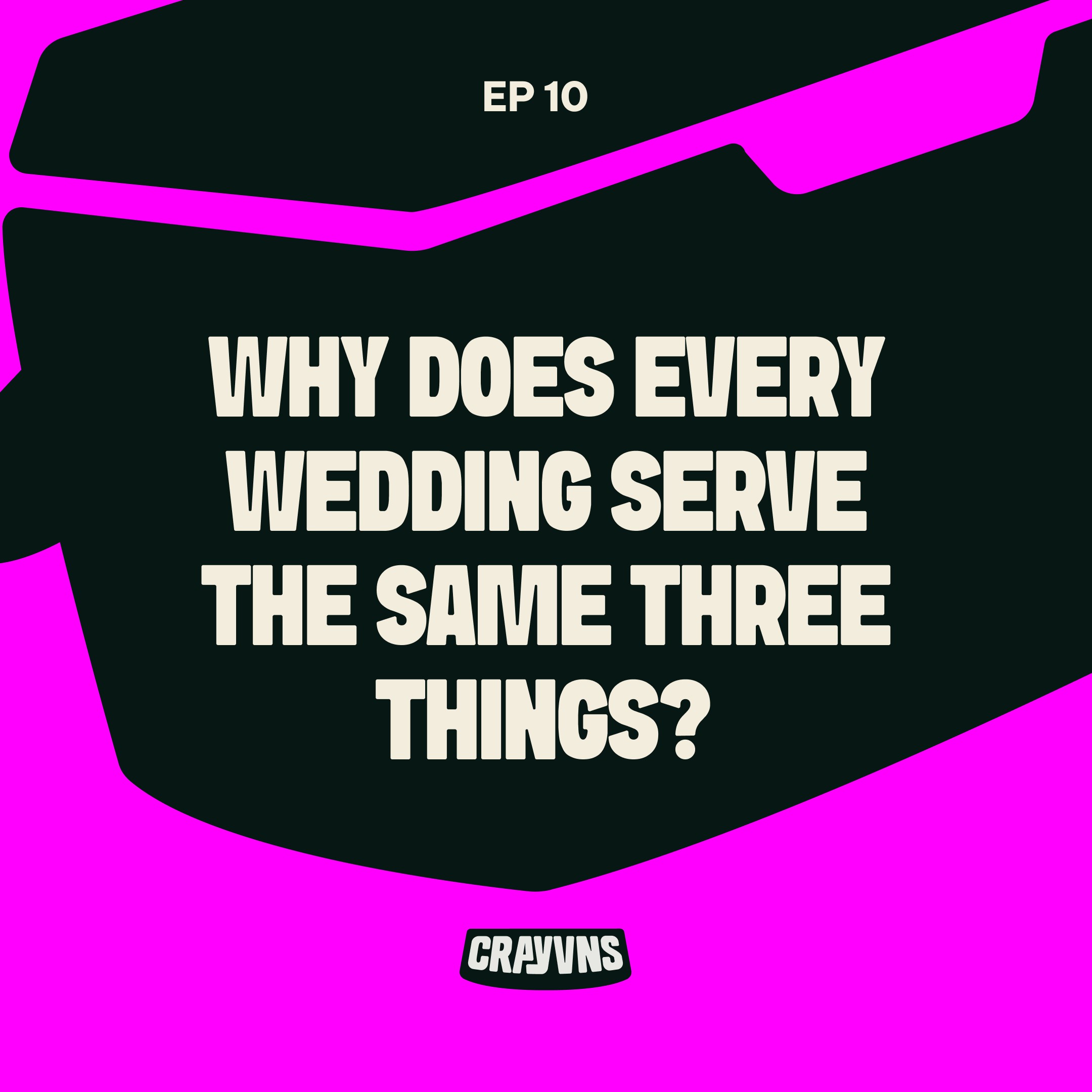
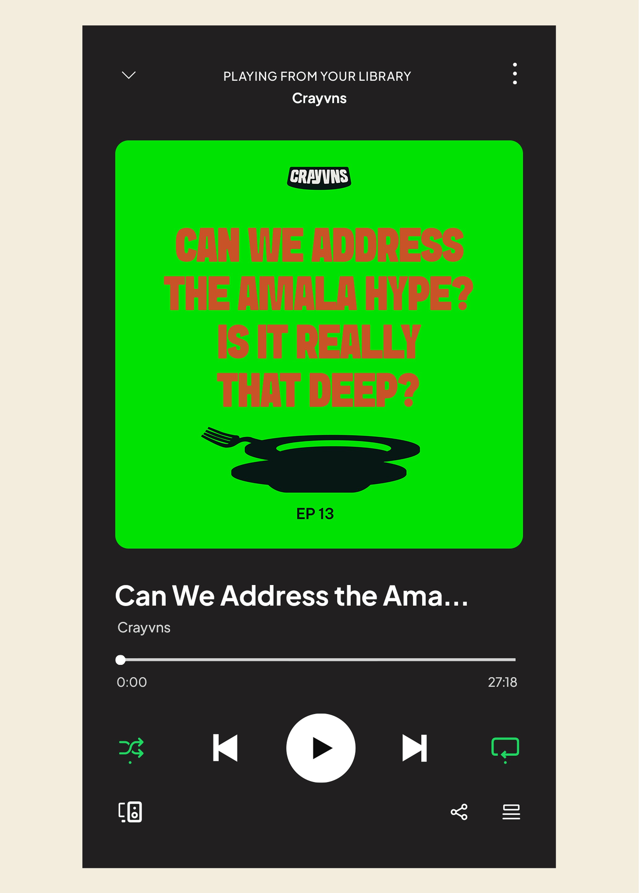
I created a logomark, wordmark, illustration system, and social templates anchored by one principle: teeth pairing. Every illustration uses duality—two elements that contrast and challenge each other, showing up minimally or maximally depending on context. Each illustration represents a different conversation type the podcast could have, with one exception (the polythene bag) serving a separate function. The system is built for scalability; new illustrations can be added as topics expand. Bold typography, always capitalized, reinforces the podcast's confidence. The aggressive color palette says "hot take" before a single word is spoken. The brand looks the way it sounds: sharp, uncompromising, ready to argue.


Previous Project
Next Project